Ad Team Rebrand
The Overview
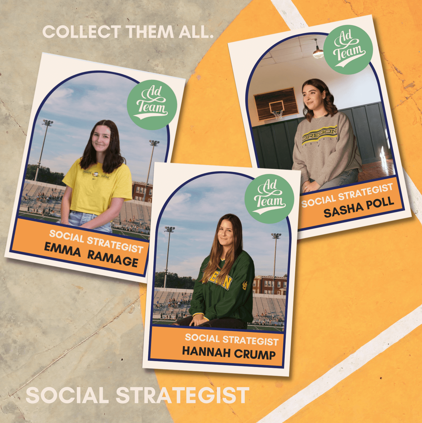
I used a systems approach to a rebranding campaign. I did this in two parts—I created a social media style guide that captures style components, from which I created 'trading cards' of each Ad Team member and sample templates for social media posts.
My Roles
Brand Design
System Design
Art Direction
Graphic Design
The Problem
Ad Team, a student-run advertising agency, was struggling to get new applicants each year. Though decently unknown on campus, the group had a reputation for being 'boring' and 'reclusive'. They lacked a social media presence.
How might we increase Ad Team's brand awareness?

The Goal
The rebranding campaign aimed to communicate that Ad Team characterizes 'playfulness' and 'sportsmanship' by using a retro sports aesthetic.
The Style Guide
After the above logo was created, I used a mood board to narrow my style choices. Color, typography, and other style components were documented in a style guide, which I handed to the media team for reference.


The Templates
Using the style guide, I created templates to expedite the media team's workflow. Both the style guide and templates were made in Canva for accessibility of non-designers.


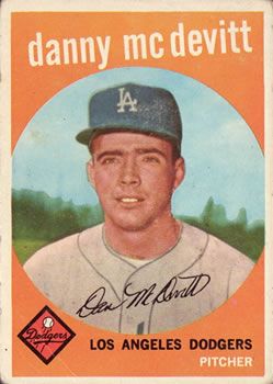
The Trading Cards
By studying baseball trading cards, I conceptualized a typology that I could use to recreate retro trading cards for our team members using the style guide. These templates could be customized with different sports backgrounds and team member information.


The Tools
Canva
Adobe Illustrator
The Team
Maya Merrill, logo design
Sophia Fuselier, mood board
© 2023 Zoe Gale